50 and 200 day moving averages provide astonishing support and resistance to stock prices. The Dow Jones Industrial Average Moving Average Figure 1 (daily chart) and Moving Average Figure 2 (weekly chart) show the incredible reality of price movement off these two averages.
When a stock’s price falls, many times it’s found breaking below its 50 or 200 day moving average (DMA). Other times, instead of breaking below the moving average, the price settles down and stabilizes (or remains) in close proximity to the 50 or 200 DMA. Theoretically financial institutions and professional investors accumulate (or buy more shares of) a stock at its 50 and 200 day moving averages. This accumulation has the effect of providing price support to the stock at the level of the moving average. Other notable moving averages which sometimes show signs of support are located around the 10, 20, and 25 DMA.
Stock prices do not always find endless support at these averages. After an uptrend has completed its move and a down cycle arises, stock prices will begin breaking below the 50 and 200 DMA. When institutions start to sell off a stock, accumulation slows down and distribution picks up. During distribution, support at a 50 or 200 DMA seems to vanish and once the price falls below, the moving average becomes an enemy or resistance to higher price achievements. Price thus reverses direction and moves lower as it is repelled by one of these moving averages.
Yet, if oversold conditions are right and demand for the stock picks up again, a stock’s price will eventually increase and move back up to its 50 or 200 DMA. Whether the price breaks out above the moving average or falls even further, these moving averages exhibit powerful indications of a stocks technical analysis health. The support & resistance write up provides a figure showing well illustrated 50 and 200 DMA support & resistance.
Calculation of a moving average:
All moving averages use the most recent closing prices of a stock. For a 10 DMA, the most recent 10 days are used. That is the closing price of the last nine days plus today is averaged together. For a 50 DMA, the last 49 days plus today are used. In the future, each new day is included in the average after the oldest day is deleted. Thus the name “moving average” is used. An average for today is plotted, then tomorrow a new average is plotted, and the following days continue this process of moving from one day to the next. After many months of plotted data, a well-defined line emerges, providing a beautiful graph to use in technical analysis decision making.
A simple 3 day moving average would be calculated adding the last 3 days together and then dividing by 3 to get the average. So if a stock was increasing in price $1.00 each day, and the closing price for the last three days were 10, 11, and 12, then the 3 DMA is (10 + 11 + 12) / 3. This results in 33/3 = 11 which gets plotted as yesterday’s 3 DMA on the chart along with the closing price of 12. If today’s price continued the same trend and increased buy another $1.00, the closing price would be 13. A resulting 3 DMA of 12 will be plotted along with today’s closing price – today’s 3 DMA calculation is (11 + 12 + 13) / 3 or 36/3 = 12. Now assume tomorrow the price drops a whopping $8.00 and closes at 5. Tomorrows average is (12 + 13 + 5) / 3 and consequently the 3 DMA plot graphed next to tomorrows closing price would be 10 (that is 30/3).
It’s the same process for a 50, 200, or other daily moving average. For a 50 DMA, the prior 50 day closing prices are added together and divided by 50. And for the 200 DMA, the prior 200 days are summed and divided by 200. As can be seen in Moving Average Figure 1 and 2, the more days included, the smoother the moving average appears on the chart.
Stock Cycles
One last significant point of interest involves stock price cycles and the 200 DMA. Moving Average Figure 3 demonstrates the typical nature of a stock’s price cycle around the 200 DMA. First a breakout above the 200 DMA occurs. An uptrend emerges, prices peak, a downtrend ensues, and finally prices bottom out before the next breakout above the 200 DMA.
When the breakout occurs on extremely high volume, it is a sign that many buyers and big financial institutions are purchasing the stock. The breakout is followed by an uptrend above the 200 DMA which continues for some time. The uptrend continues until a peak in the stock’s price and a flattening out of the 200 DMA occurs. When sellers become too numerous for the buyers, the stock’s price plunges below the 200 DMA and begins the second half of the stock’s cycle. During this downtrend, the stock’s price will approach the 200 DMA, but with each failed attempt to breakout, the price drops even further than previously. Finally the downtrend hits a bottom and the stock’s price refuses to go lower. Again the 200 DMA flattens out and this time forms a trough. Stock prices remain stuck in the trough region until another cycle begins with a breakout above the 200 DMA.
Long term investors typically buy and hold their stock positions for a long time. Many times they are watching stock charts for breakout opportunities above the 200 DMA as a place to take an initial position. Once a purchase has been accomplished, they watch for the 200 DMA to flatten. When the 200 DMA flattens out after a peak, they are extremely careful to exit their position if and when the stock breaks below the 200 DMA. Needless to say, an investment in a stock should usually be avoided when the 200 DMA is in a downtrend. The best approach is to be patient while waiting for the next uptrend breakout which should follow a price trough.
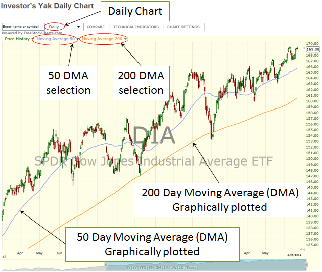
Moving Average Figure 1
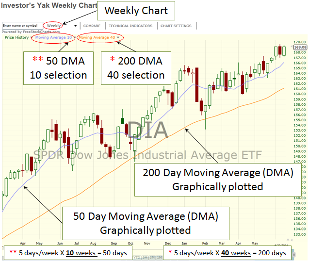
Moving Average Figure 2
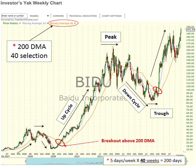
Moving Average Figure 3